...
sectioncolumn |
1.「作成」リンクをクリックして、「レポート」を選択しレポートの作成を開始します。 |
| Column |
|---|
|
 Image Removed Image Removed
|
| Section |
|---|
| Column |
|---|
| 2. 「新規レポート作成」ページが表示されます。レポートの作成方法として、「ドラッグ&ドロップビルダー」を選択します。 |
| Column |
|---|
|  Image Removed Image Removed
|
|
| Section |
|---|
| Column |
|---|
| 3.ビューとして「Ski Team」を選択します。 4. 「 Image Removed」ボタンをクリックして次に進みます。 Image Removed」ボタンをクリックして次に進みます。 |
| Column |
|---|
|  Image Removed Image Removed
|
|
| Section |
|---|
| Column |
|---|
| 5. 「Athlete Country」フィールドと「Athlete Geo Polygon」フィールドをドラッグします。 6. メトリックをドラッグします。この例では、「Invoice Estimate」が最小、最大、平均として3つ使用されています。 7. レポートの表示を「グラフのみ」として設定します。 8. 「Image Removed次へ」をクリックして続行します。 |
| Column |
|---|
|  Image Removed Image Removed
|
|
| Section |
|---|
| Column |
|---|
| 9. 表示ページで、グラフアイコンをクリックしてグラフを編集しGIS Googleグラフを設定します。 |
| Column |
|---|
|  Image Removed Image Removed
|
|
| Section |
|---|
| Column |
|---|
| 10. 「グラフ」メニューから「マップ」を選択します。次に、「GIS Googleマップ」タイプを選択します。「保存」をクリックして選択を保存します。 |
| Column |
|---|
|  Image Removed Image Removed
|
|
| Section |
|---|
| Column |
|---|
| 11. 「グラフデータ」セクションがGISマップに関連するフィールドで更新されたことがわかります。 12. 次を選択してください: GISフィールド:Athlete Geo Polygon
メトリック:Max Invoice Estimate
ラベル:Athlete Country 13. 「更新」をクリックして、マップを生成します。  Image Removed Image Removed
|
| Column |
|---|
|  Image Removed Image Removed
|
|
| Section |
|---|
| Column |
|---|
| 14. グラフの書式オプションで、「シリーズ選択の表示」を選択します。 |
| Column |
|---|
|  Image Removed Image Removed
|
|
| Section |
|---|
| Column |
|---|
| 15. これで図に示すようなマップが作成されました。これは、参照できるようにGoogleマップの上に重ねられたGISマップと同じです。 |
| Column |
|---|
|  Image Removed Image Removed
|
|
...
概要
マーカー座標にGISデータを使用した、Google マップです。このグラフには、Geo PointやGeo Polygonなどの、GISデータが必要です。また、ISOコードを使用してグラフを作成することもできます。
ヒント:polygonデータを使用してグラフを作成する場合、レポートのディメンション(次元)値の量を削減するか、ひとつのレポート内にpolygonデータを含むマップをひとつに制限することを推奨します。これは、polygonなど、値の大きなデータを処理するときに、システムメモリが使い果たされる可能性があるためです。
| Note |
|---|
こちらのマップを使用するには、Google APIキーが必要です。より詳細な情報は、こちらを参照してください。 |
グラフデータオプション
| オプション | 説明 |
| ジオフィールド | ジオポイント、またはジオポリゴンデータを含むフィールドです。 |
| 色 | マップに表示されるメトリック(数値)フィールドです。 |
| ツールチップ | ツールチップに表示される値です。 |
手順
データセットを使用して、GIS Google マップを作成するには、以下の手順に従います。
- Click on the Create button and select Report to begin building your report.
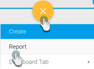 Image Added
- Select your preferred View containing the geographical data. For the purpose of this example, we will choose Ski Team.
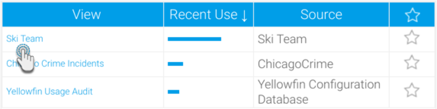 Image Added
- レポートビルダー画面で、ジオポイントやメトリック(数値)フィールドを含む必要なデータを、レポートに追加します。今回の例では、
- 書式設定のヒント: デフォルトでは、レポートビルダーは、ジオポイントやジオポリゴンデータに「デフォルトジオメトリー」を適用します(そのため、以下の例のような表示になります)。しかし、この書式を変更することで、データを元の形式で表示することができます。
- ジオポイントのカラム(列)メニューで、「書式」をクリックし、「編集」を選択します。
 Image Added
- 表示されるポップアップの「書式」項目で、「RAW書式」を選択します。
 Image Added
- ポップアップを閉じます。ジオポイントデータが、元の形式でレポートに表示されます。
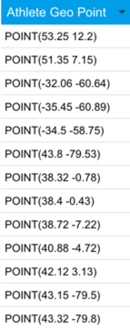 Image Added
- 注意:値の大きなジオポイントや、ジオポリゴンデータにRAW書式を適用すると、レポートの処理時間が遅くなる可能性があります。
- 「グラフ」画面へ移動し、「グラフの選択」を展開します。マップ項目から、「GIS Google マップ」を選択します
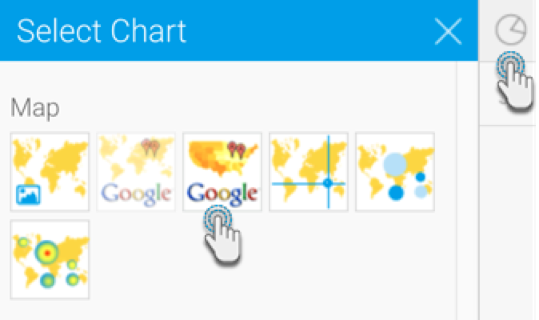 Image Added
- Next, fill the required fields for your Google map chart, for example drag Athlete Geo Point to the Geo Field, and Invoice Amount to the Color Field. You can refer to the above Chart data options section for a description of all the fields.
- You will be able to see the map chart. The location data (if selected location data is Geo Points) will be displayed as:
 Image Added Clusters (Grouped Points); and
  Image Added Points.
 Image Added
The cluster behaves differently from a point. The number on the cluster indicates the number of points. As you zoom in, the clusters will open up to show the individual points. If you click on a cluster, its tooltip will display the values within it.
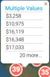 Image Added
The single data point will show the value of the Color field.
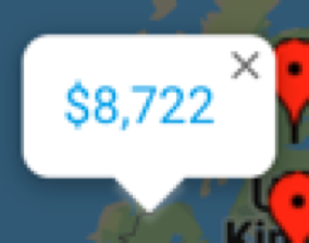 Image Added
- Trouble shooting: If you see the following error message on your map, then ensure that you have a valid Google API key.
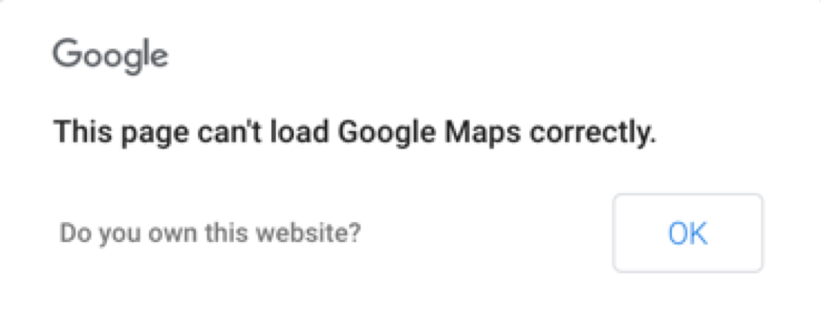 Image Added
- You can also use the chart formatting settings to configure your Google chart. Refer to our chart formatting section for more information.
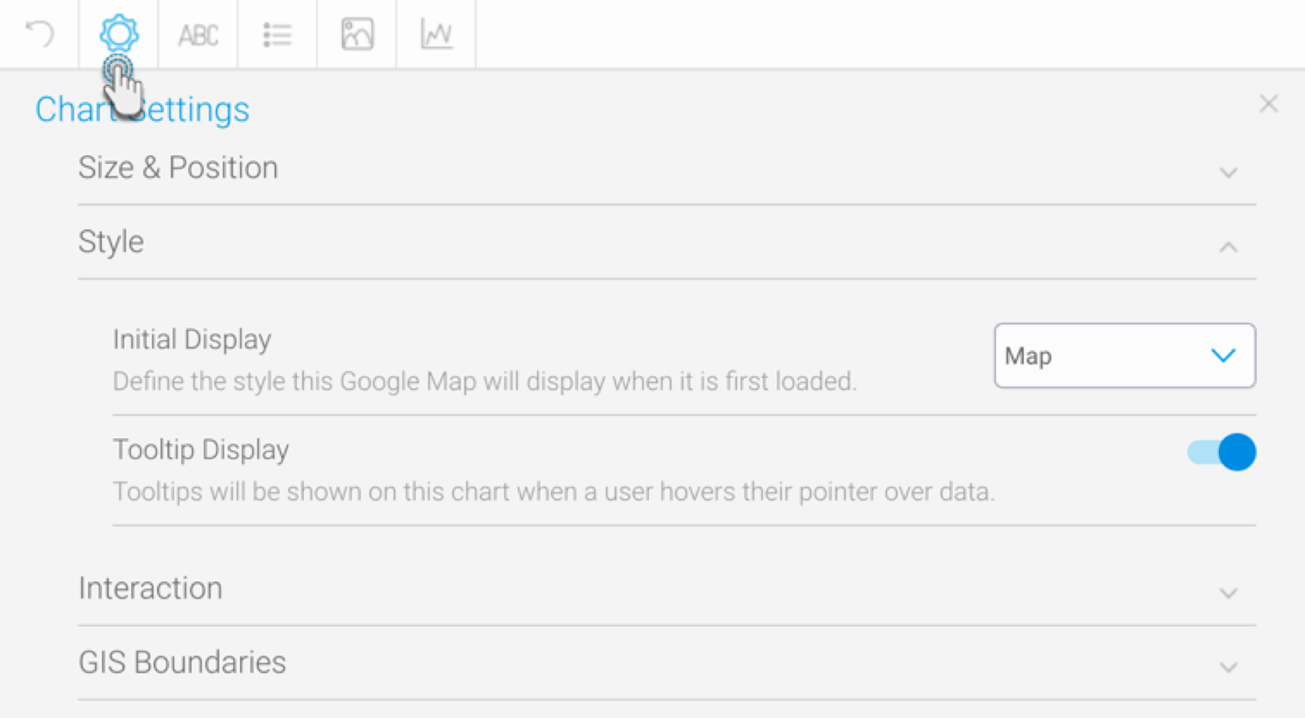 Image Added
- Once done, save your map.